Help users get back to the best experience
Google Photos
Overview
Our storage policy change meant all users could run out of space, and the issue grew faster than the user base. We preemptively addressed this with a new storage tool but we needed to do more for our users.
My role
I was the Lead, Senior Designer responsible for developing the strategy, aligning leadership, developing our product roadmap, and designing the solutions shown. I did this in close collaboration with the whole crew: Product Management, UX Research, UX Writing, Marketing, Analytics, Project Management, and Engineering.
Note: As the strategy has evolved, I’ve expanded my team and brought on two designers. Parts of the strategy that haven’t been launched to the general public will not be shown. Stay tuned for more updates.
Goal
Decrease the number of users that are out-of-storage by X%
Challenges
We ran a series of surveys and analysis that gave light into the biggest challenges users were facing.
“I don’t understand my options”
Users face trade-offs (pay, time, risk) when managing storage. Research showed they didn't understand these and analytics revealed that those who tried managing twice eventually bought additional storage.
“I don’t understand what happens”
Photos stay visible in the app (from device), creating a false sense of security. However, only backed-up photos are searchable or used in features like Memories, leading to photos seeming like they were missing.
Impact
We successfully achieved and exceeded our OKR as well as identified numerous opportunities that led to expanding the UX team. 🎉 👏
Developing the strategy
Analytics
The analytics team created an analysis of users currently out-of-storage. Understanding how users behaved was key to developing the strategy. We found that users usually purchased Google One after the 2nd attempt at managing storage, validating that managing storage is only a short-term solution to the problem.
User research
I worked with UXR to create user studies to understand more about users that were out of storage and the pain points that they were having.
I also conducted my own user testing through “speed dating” sessions. Through this research we validated that if we were able to effectively communicate the tradeoffs of managing vs buying, users were more compelled to buy.
Cross-functional workshop
One of my favorite things to do. I love getting everyone in a room, looking at the problem space and ideating on potential solutions. I shared the ideas post-workshop with the broader team and had everyone vote on favorites or leave comments to push ideas further.
Aligning leadership on opportunities
We brought together the user research, data, wireframes and presented to leadership how we could tackle decreasing the number of users that are out-of-storage. We gained alignment, addressed feedback, and set off to get the designs ready for user testing and engineering.
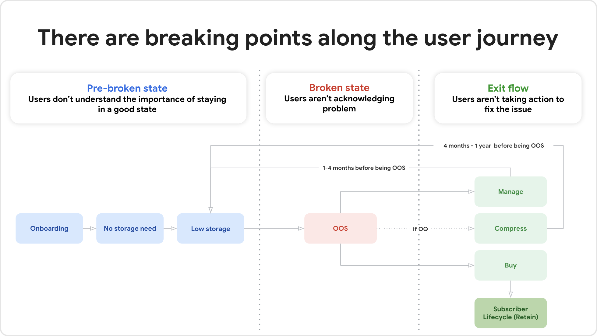
Diagram of the user journey used to describe our strategy to directors.
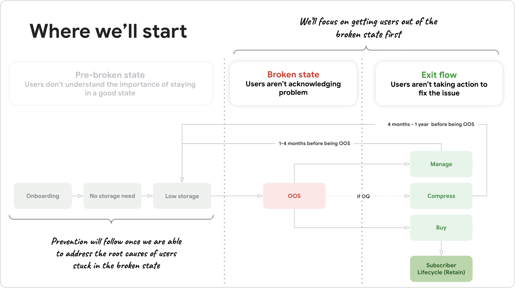
Illustrating that we’ll focus on getting users back into a good state first and then preventing them from getting into a bad state later.
Creating a guided out-of-storage experience that starts on the first day a user has run out.
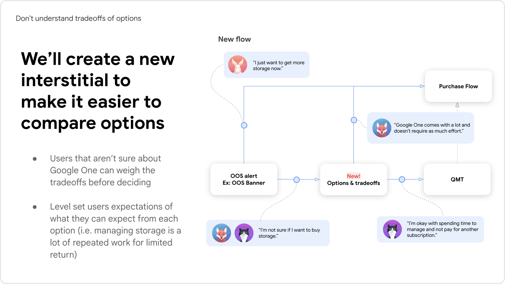
Making it easier for users to evaluate their options and make a choice that’s best for them.
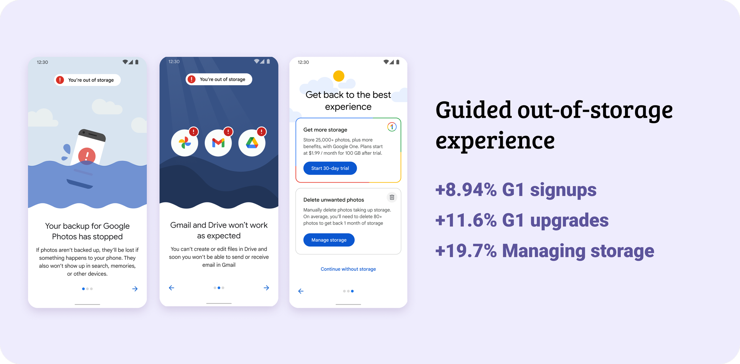
Guided out-of-storage experience
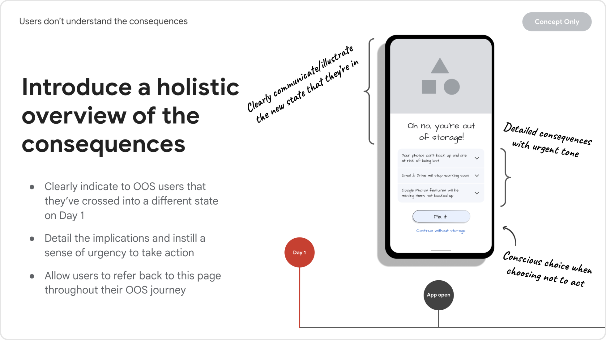
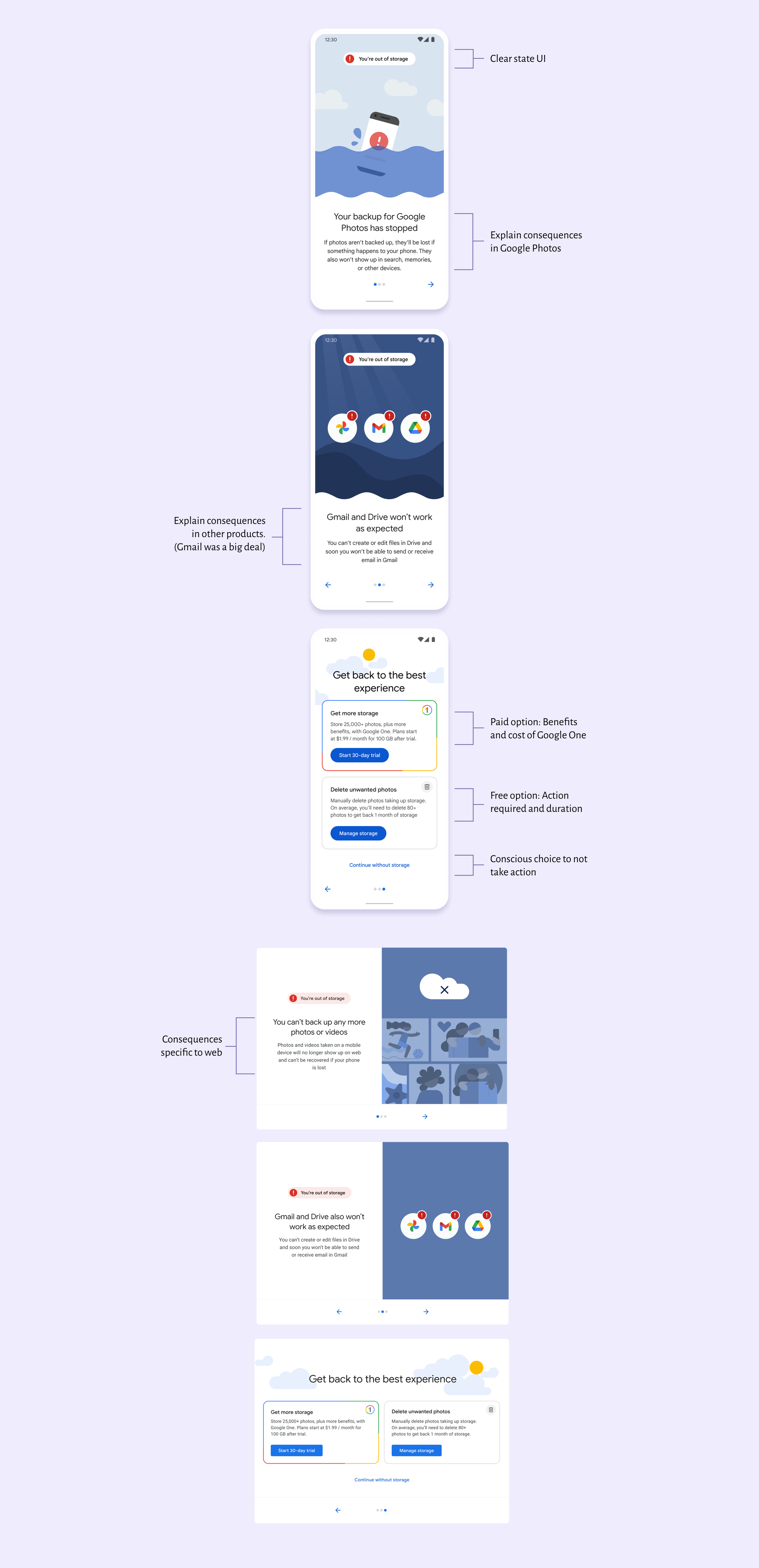
On day one of being out-of-storage users would come into the app and we’d introduce them to the new state that they’ve entered and what they could expect.
Educate about their options
Through testing, users that were shown the details of each option together were more likely to skip trying to manage storage and purchase Google One. Many users didn’t realize that storage was only $1.99/month or how much they’d need to delete to get back a small amount of time.
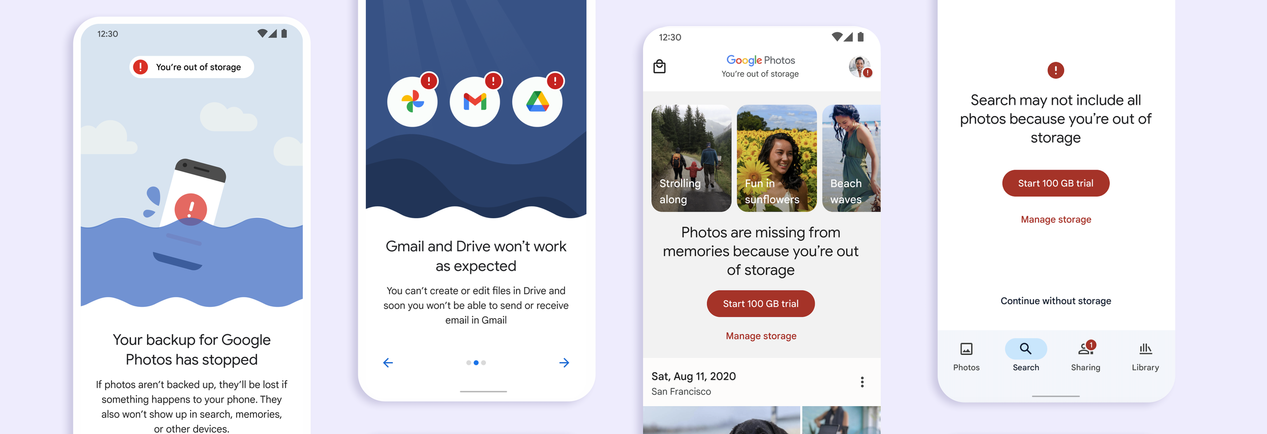
Add friction to create a “pause”
Many users were ignoring this state and had banner blindness from our current banners on the grid. However, in user testing when users learned that Gmail would stop working or photos were at risk of being lost, we increased the urgency for them to take action.
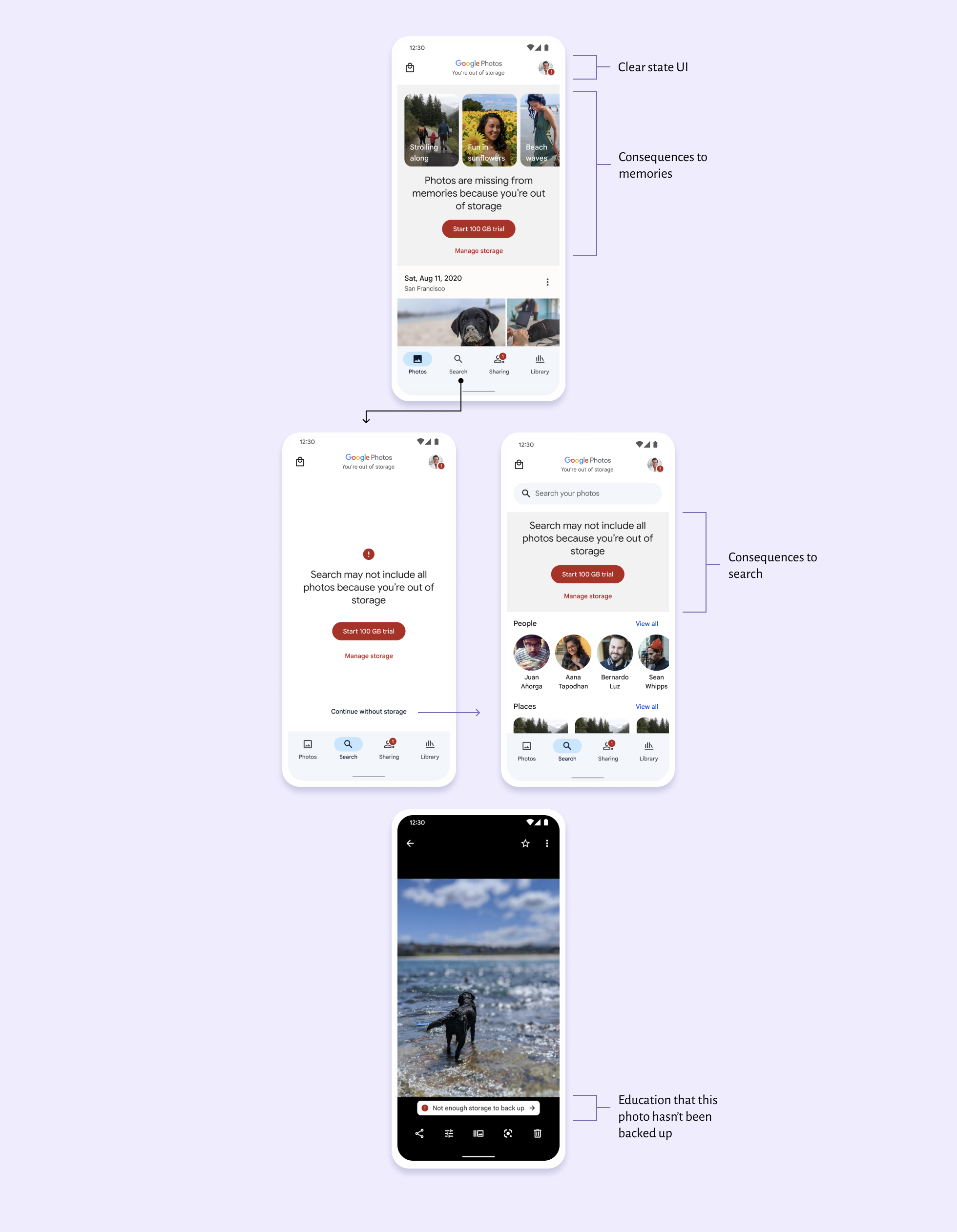
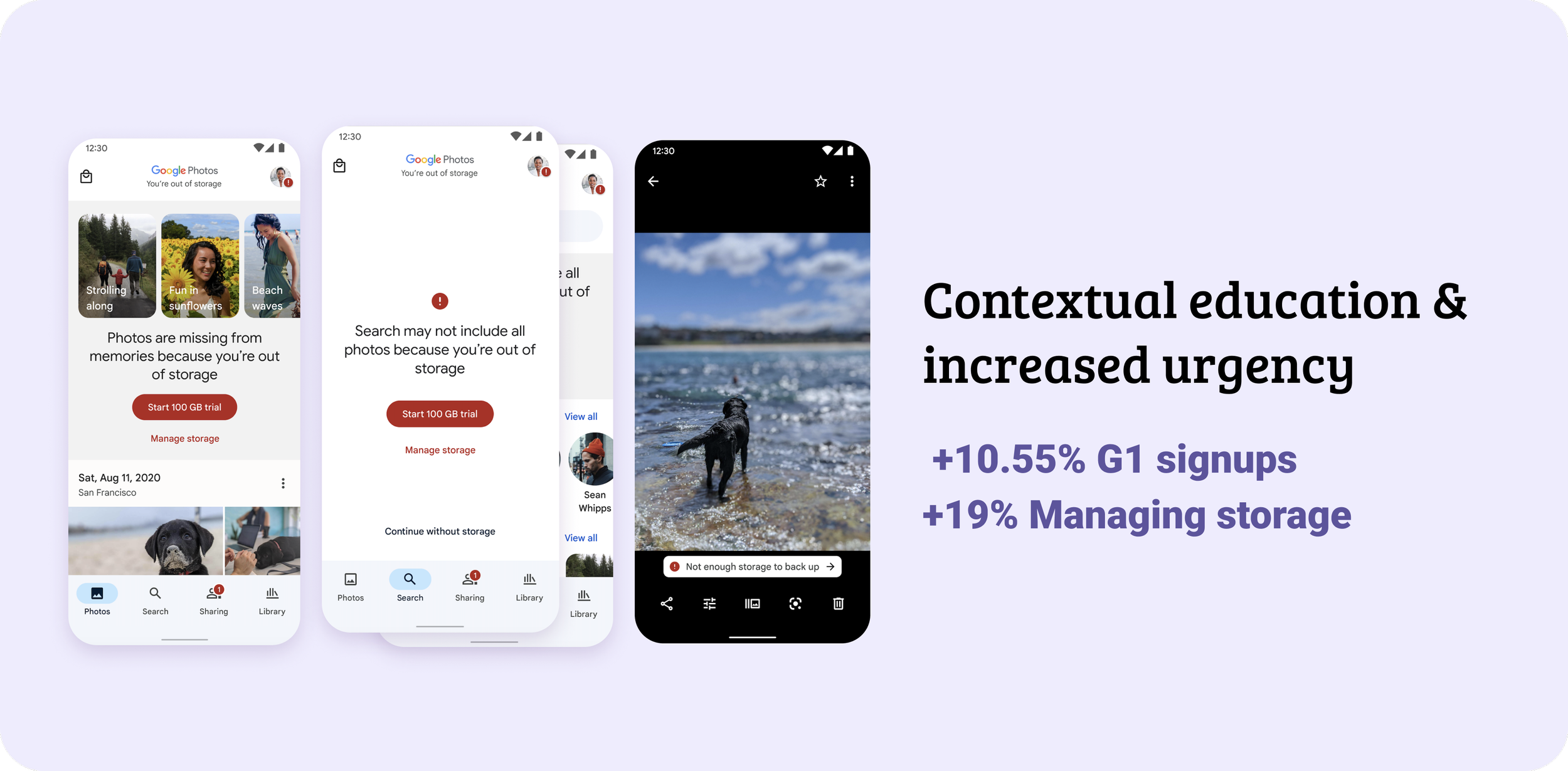
Add contextual education and increase urgency
We ran an experiment to validate headroom of adding more contextual UI. We designed big and bold banners on two surfaces that were the most impacted (Memories and Search). This project was meant to be a learning experiment that never launched. However, because it was so successful in getting users to manage storage or subscribe to Google One while not decreasing our guardrail metrics, it ended up launching to the public.
Educate on the consequences
Photos and videos not backed up because of storage would appear to be missing in Memories and search queues.
Call attention to the issue
“Go bold” was the theme of this project. Big UI that would hopefully decrease banner blindness and encourage users to take an action.