Premium features
Overview
Our main source of revenue was storage and Photos needed to diversify. We decided to experiment with adding premium features into our editor. Our hypothesis was that by adding more value to the subscription more users would convert before they ran out of storage or when they did run out of storage.
My role
I was the Lead, Senior Designer responsible for developing the strategy, aligning leadership, developing our product roadmap, and creating a premium features framework. I did this in close collaboration with the Lead Designer of the editing experience, Product Management, UX Research, UX Writing, Marketing, Analytics, Project Management, and Engineering.
During our go-to-marketing campaign I worked closely with our motion designer and art directed Art and Letters agency to put together our first Google One memory reel. This reel allowed us to showcase new features in a more immersive way.
Goal
Increase Google One subscribers from Google Photos without a storage need.
Impact
The initial experiment validated premium features by increasing Google One subscribers by 15%. Later, our first go-to-market campaign resulted in an increase of monthly Google One subscribers by 43% while the campaign was running. 🎉
Google Photos
Getting started
Competitive analysis
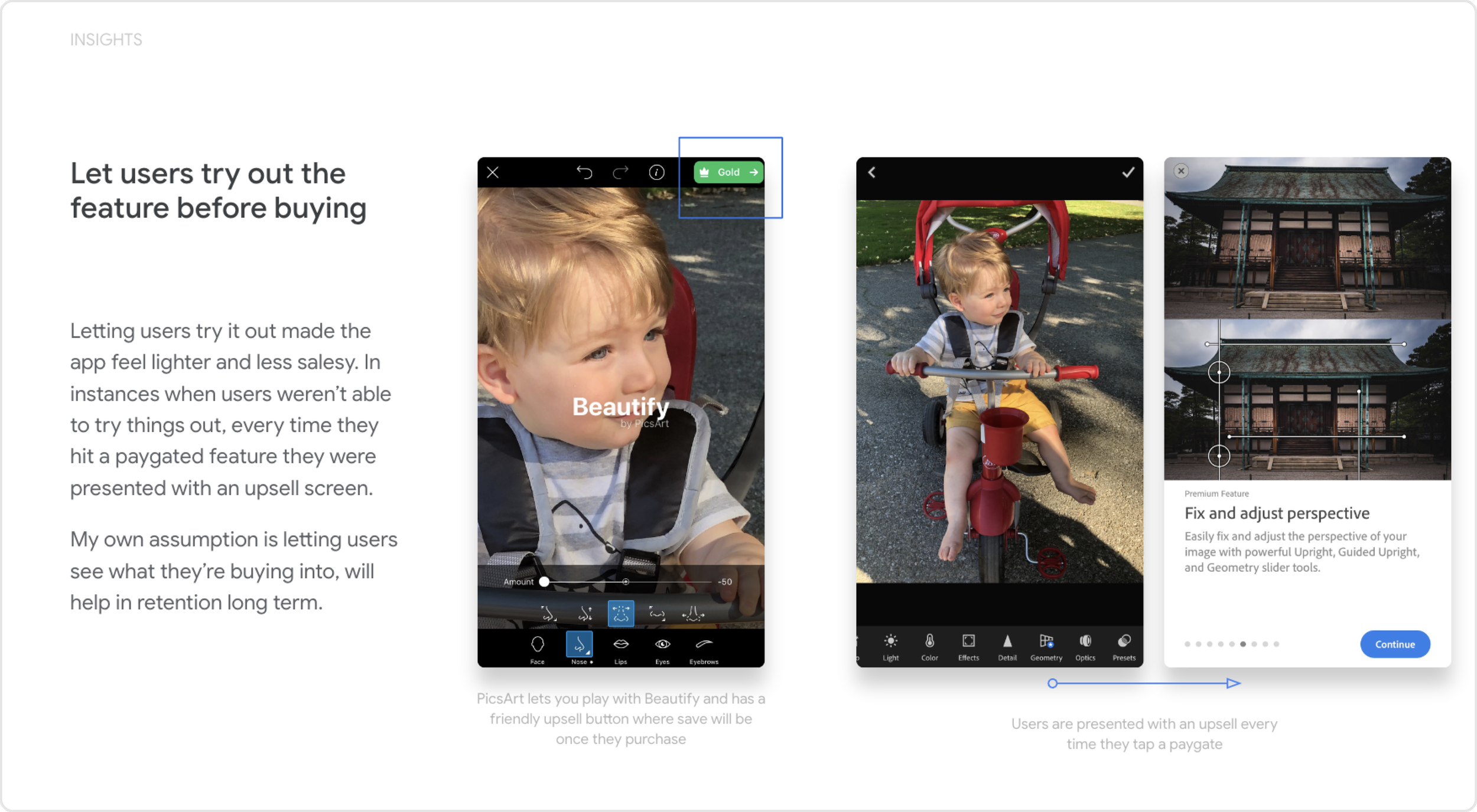
I analyzed numerous apps that offered in-app purchases or paid subscriptions. This analysis became the foundation of the framework and guiding UX principles, such as “Always let users try the feature before purchasing”, having a permanent entry point, and reminding users of the value they are paying for even post subscription.
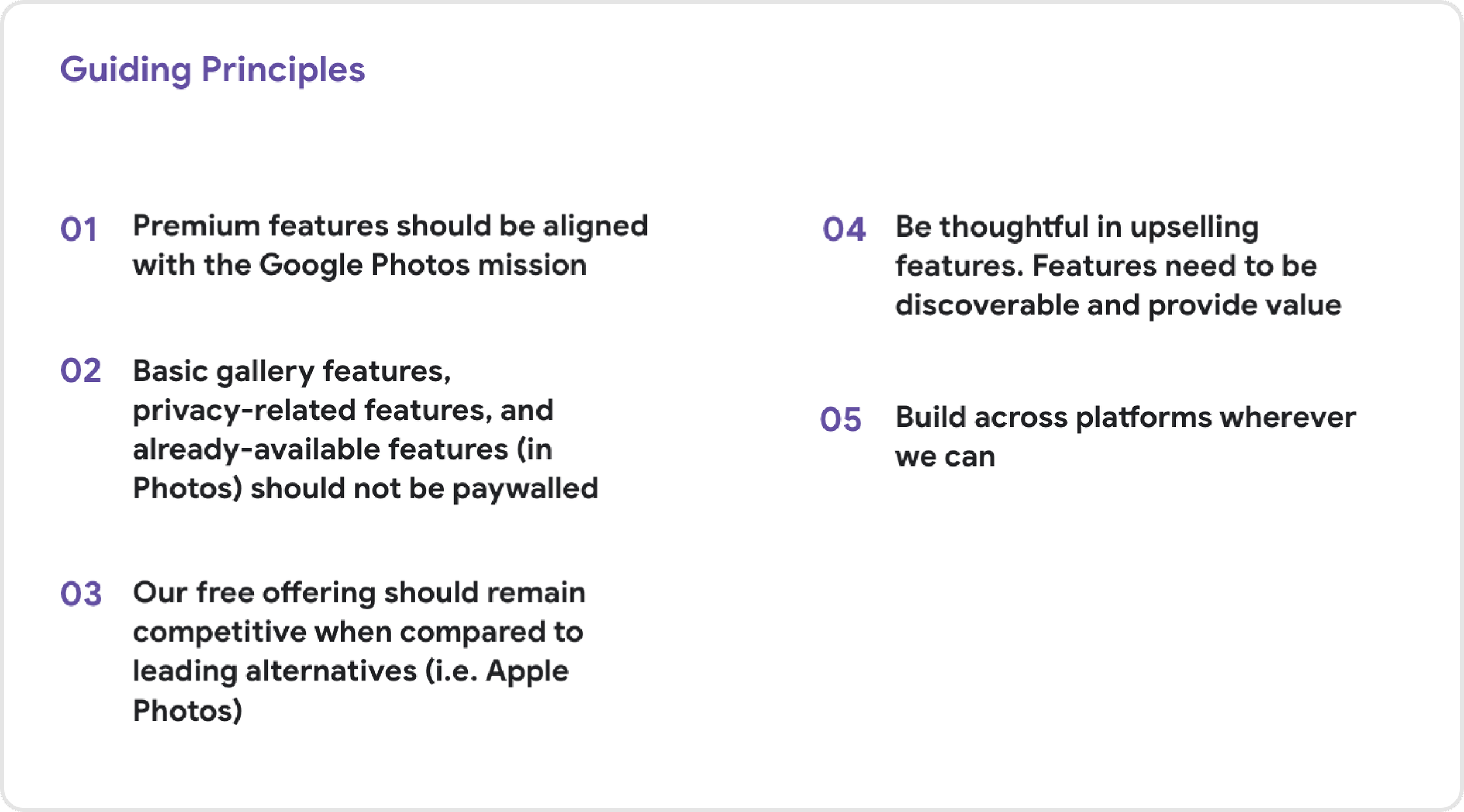
Defining our principles
This was an ambiguous space for us and we wanted to develop and align on principles so that we could make progress faster and make sure we were sticking to our values.
Lots and lots of marketing and user research
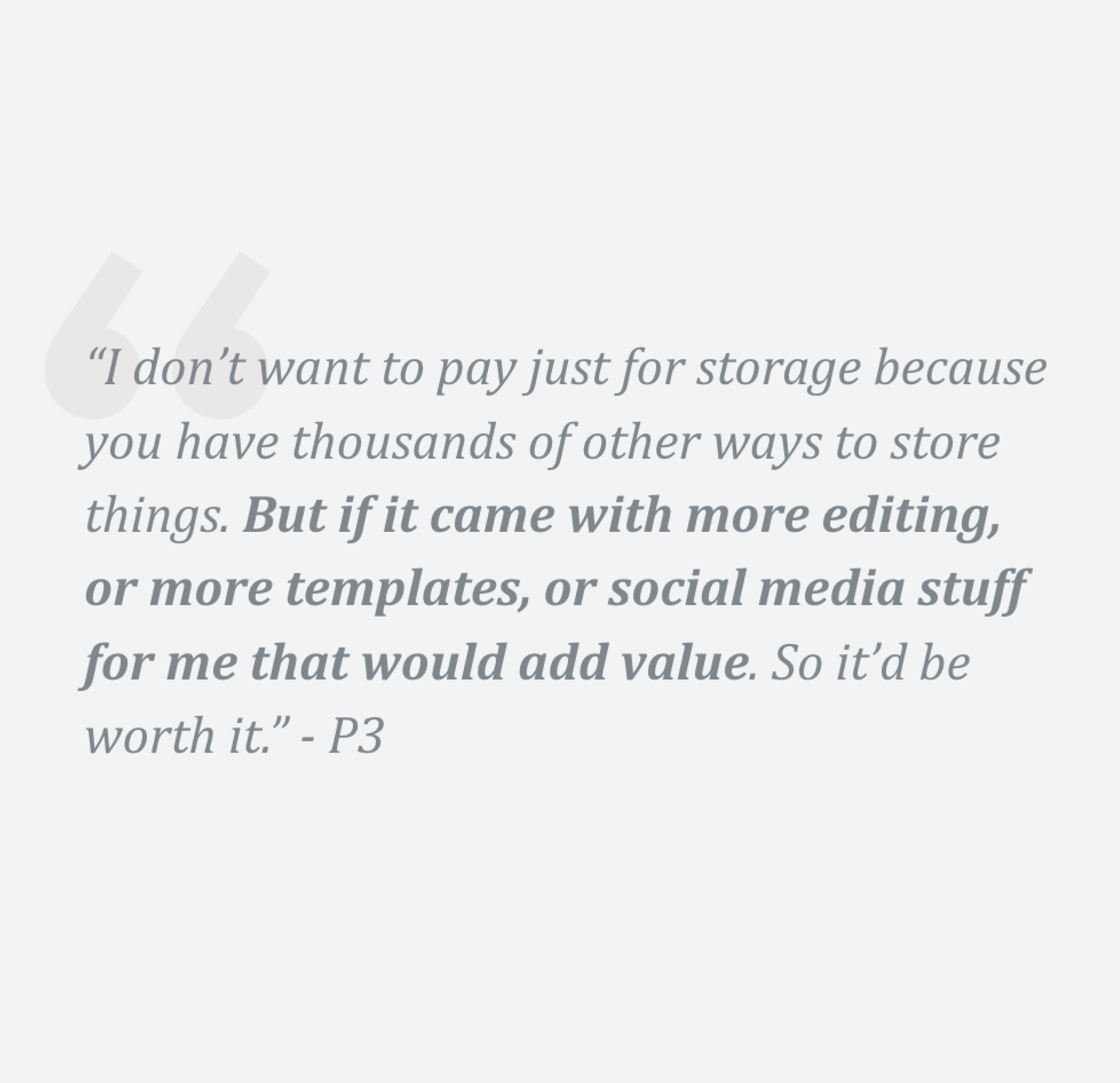
We needed to figure out if our premium features were valued enough for users to want to pay for them. We also identified different bundles of different features that could make the Google One subscription more compelling.
Creating the framwork
Using the guiding principles that I developed during the competitive analysis, I designed the framework that we would use to apply to the framework we built for paid features in the app.
Scaleability
The framework needed to be scaleable so that every mission on Google Photos could repurpose it with paid features within their product area, like Memories or search.
Extensibility
Not only did it need to scale it needed to be extensible, so that we could add many paid features to the offer and the system wouldn’t break. It also need to extend beyond Google Photos as Google One started to add more paid features from other Google products.
Identifying key components
Using the competitive analysis and research, I identified the components we would need for the paid experience. From there, we started design explorations and validating concepts through user research testing.
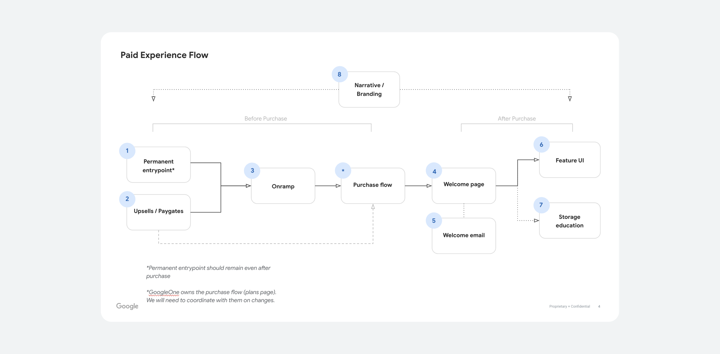
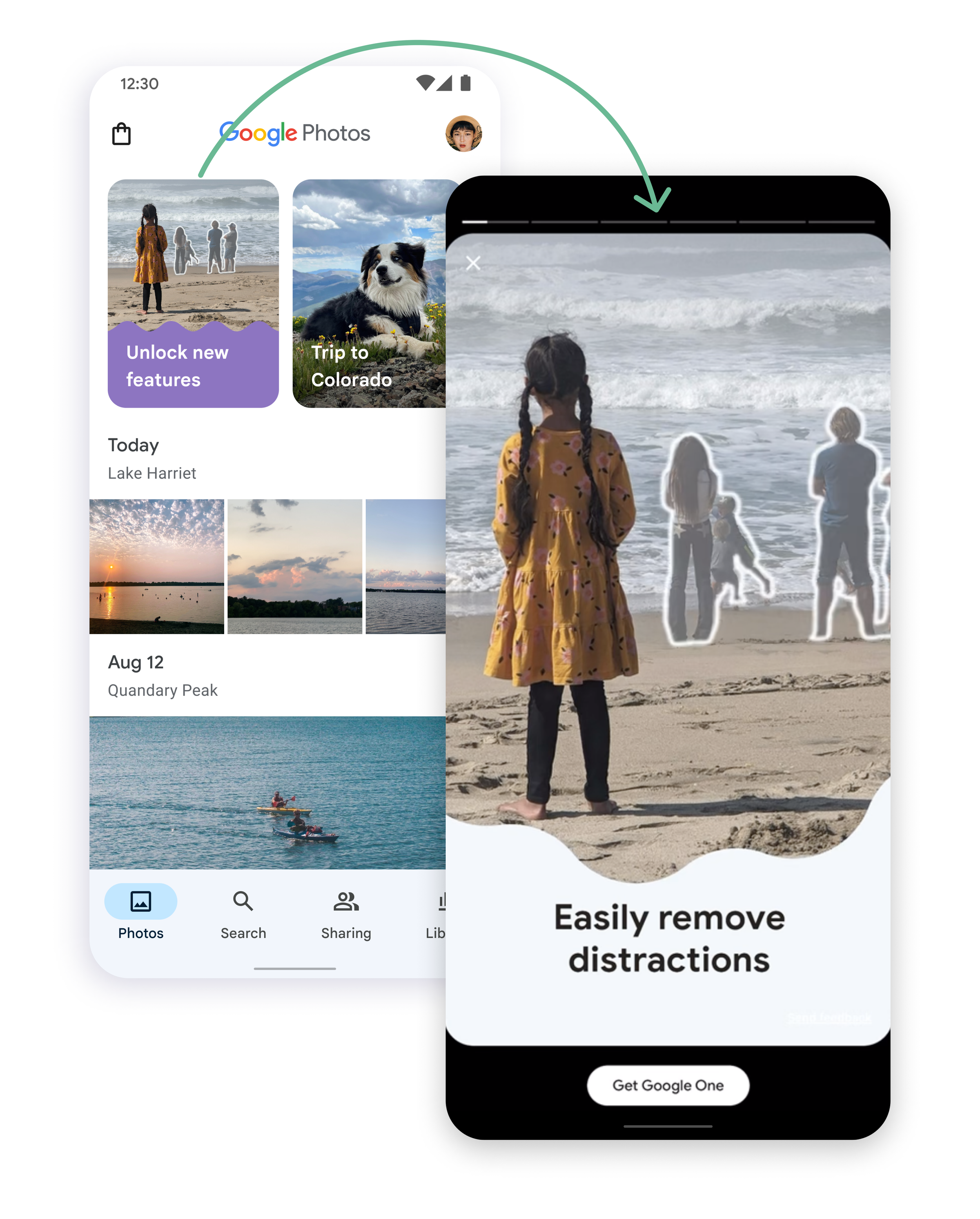
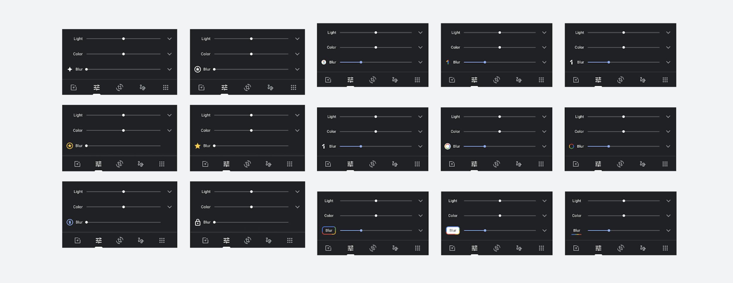
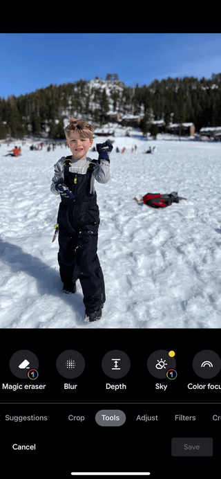
Badging and entry point
I led a cross-product brainstorm with designers from Google One and Photos to brainstorm on the different badging and entry points in the editor. The Lead Designer of the Editor and I then collaborated on the badging and entry point through the editor.
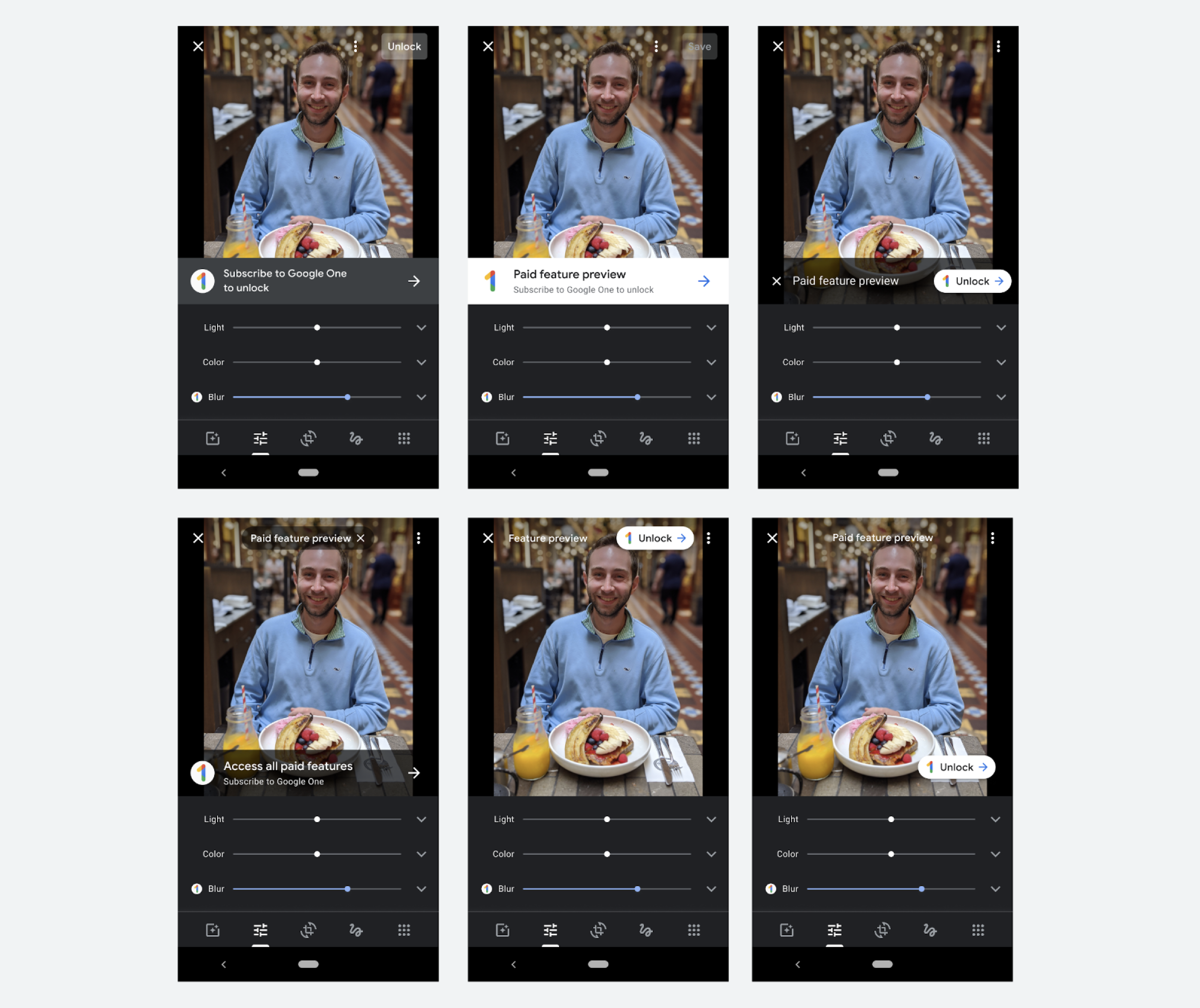
Onramp
We did numerous design explorations for the onramp from the point of entry. We ran various user testing and removed pieces that didn’t test well and expanded on ones that did leading to the final design.
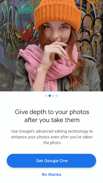
We wanted the design to be dynamic based on where the user came from in the editor. If the user had used Magic Eraser, then the hero image would change to Magic Eraser, if they came from sky filters it would change to sky filters, etc.
However, even though this tested well in UXR. The team felt that this became redundant since the user just came from that feature. We changed to showcasing the top feature instead.
One contender for interstitial used a carousel to go through the features and leaned on Google One branding. However, when testing in UXR this wasn’t scalable as we add more features to the offer.
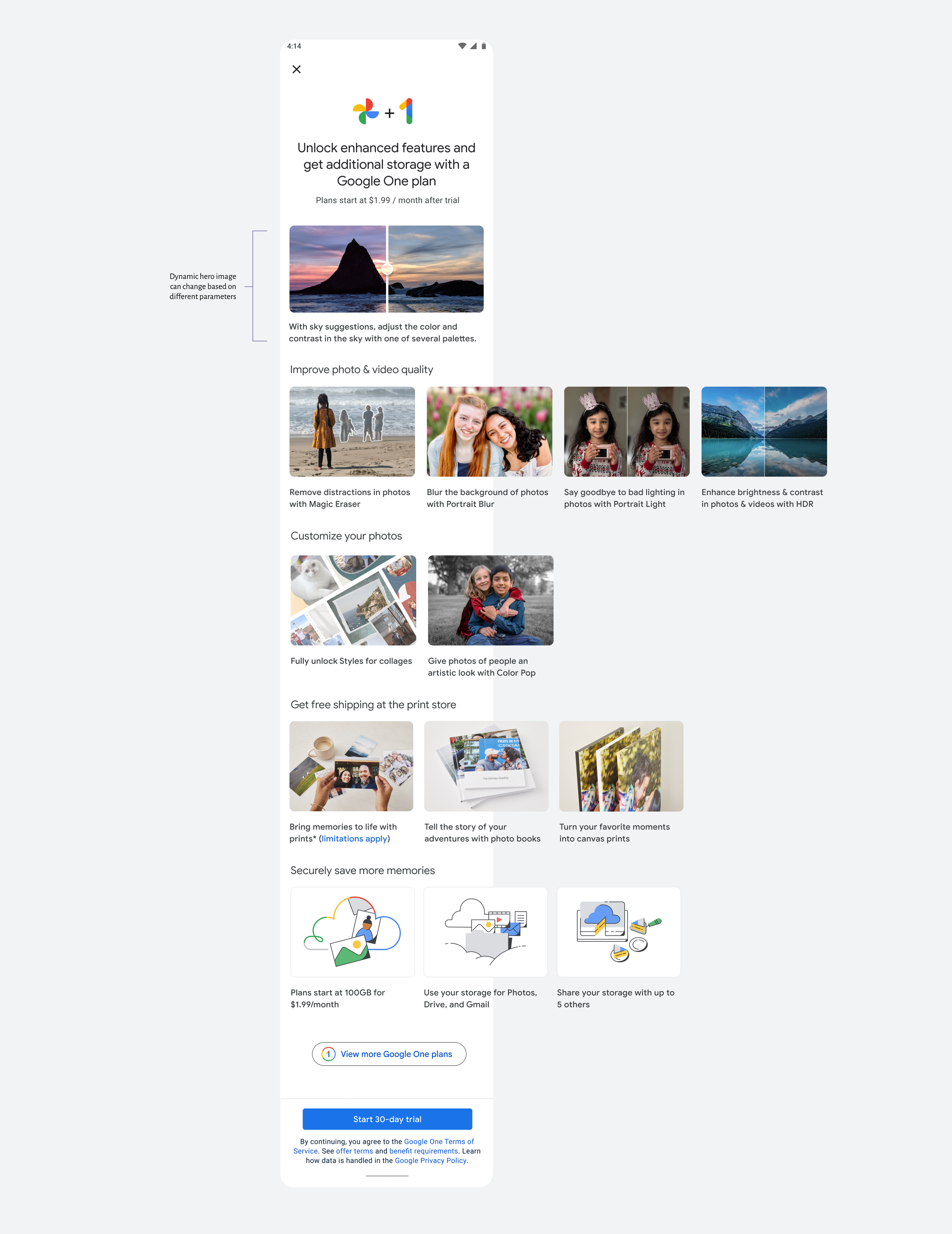
This design performed the best. Users liked that they could toggle the top image and see the affect applied.
They also liked the scalability of the smaller carousel rows and could browse the features more easily.
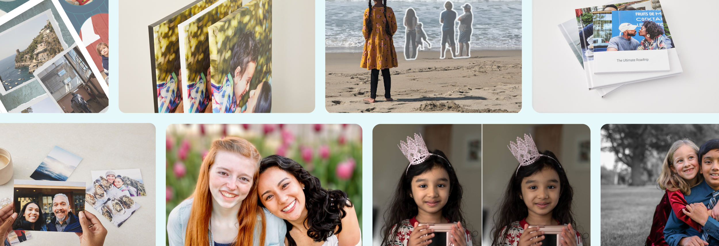
The paid feature flow
Creating a seamless flow from trying out the paid feature, discovery more features, and the ability to purchase Google One.
Designing for web
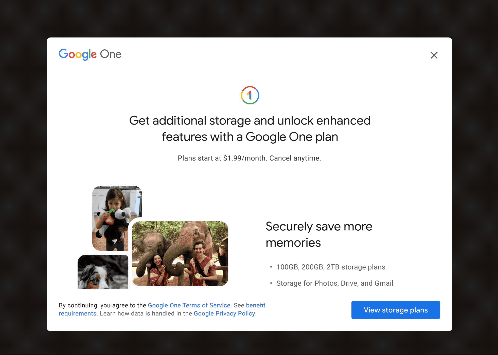
All of our paid features are on mobile so we used our storage entry points on web to educate users about additional features they could get in the mobile app if they subscribed.
Launching our first go-to-market campaign
In-app announcement
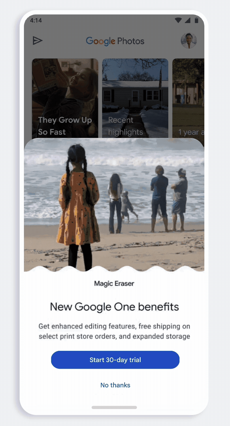
I partnered with our motion designer to design a half-sheet to announce the new features that can come with Google One.
We wanted to visually showcase the features to catch users attention before dismissing. Despite half-sheets being typically ignored, this half-sheet resulted in
Memory Upsell
Putting an upsell in the memories panel was a pretty controversial thing. The memories team didn’t want to have ads interrupting the reminiscing experience.
Which I agree, but when used tactfully to bring awareness to new, fun features – it warrants the use of more prominent surfaces.
I was able to align leadership and missions into trying this new surface out with the go-to-market campaign by showing data about our current awareness to paid features, how other apps (Instagram, TikTok, Snapchat) were doing something similar and how impact we could potentially get.
I created a storyboard for the ad and art directed the Arts & Letters design agency to create the animations.